Piloting a payment app that adds a human factor to p2p payments
MoKa was a concept born in the Innovation Lab at USAA. The model was to quickly build prototypes, or stripped down versions of features, to test concepts that would eventually be integrated into the main banking and insurance mobile app.
Role
Lead Product Designer
Company
USAA Innovation Lab
Duration
3 months
Outcome
Integrated into the main app
The Approach
Money between people is rarely only money
When we exchange money with friends and family, there's often a larger conversation attached. We discuss the reasons for asking, giving, and even accepting. Because it's between the people closest to us, we might accept another form of payment too. A favor here, some time there, and we're even.
The goal was to validate whether members would use a member to member payment system that surfaced those smaller, meaningful moments, and then to find a way to bring the best of it into the main enterprise app.
- 01
Test the idea before building it
Stripped down prototypes let us learn what members wanted without committing the main app to a concept.
- 02
Keep the conversation with the payment
Requests, offers, and trades live in the same thread as the money, the way they do in real life.
- 03
Design for the members most likely to use it
We picked a small pilot audience that represented the range of people who would sign up.
Part 01 · Personas
Choosing the pilot audience
The Problem
We needed a pilot group that would tell us something real about the concept, without trying to recruit every kind of member.
The Solution
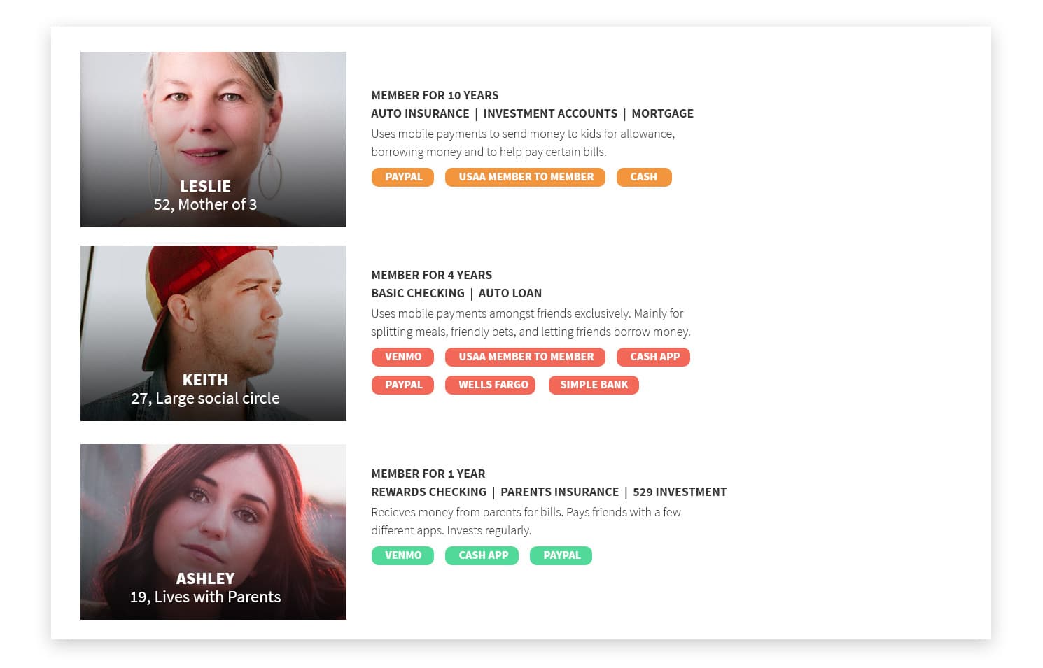
We narrowed the audience to three types of users: one year members who were power mobile banking users, roughly four year members who were heavily invested in the main app but also used other apps to send money, and long standing members who were new to exchanging money through a mobile app.
These embodied what we were looking for and the people most likely to sign up.
Details Worth Noting
Current tools are part of the profile
Each persona lists the apps they already use, such as PayPal, Venmo, Cash App, and cash, so we could see what MoKa would be competing with.
Reasons for paying differ
Allowance and bills for Leslie, splitting meals and friendly bets for Keith, and money from parents for Ashley.
Part 02 · Research
What members told us about payments
The Problem
We wanted to understand how members actually used payments, and whether the larger connection around exchanging money was real.
The Solution
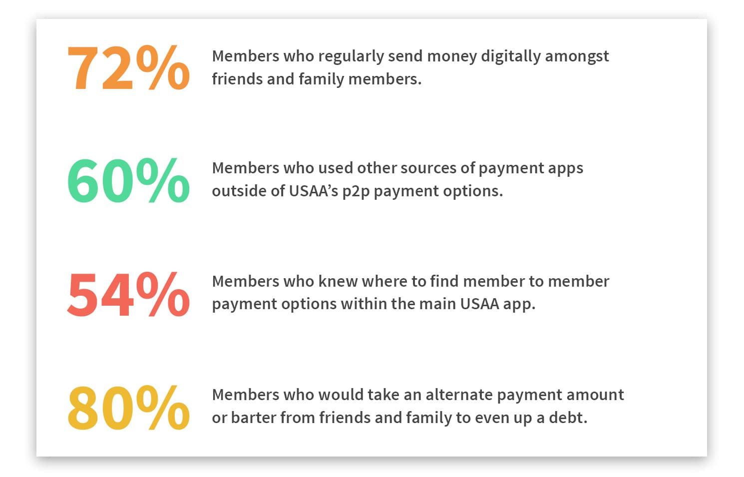
Although p2p transactions were frequent, most members didn't know the capabilities within the app. Most would also happily accept a trade in exchange for money when dealing with friends and family.
That confirmed our initial question about the type and frequency of transactions within people's own circles, and let us know there was a larger connection when exchanging money.
Details Worth Noting
Discovery was a gap
Only 54% of members knew where to find member to member payment options in the main app.
Other apps filled the space
60% used payment apps outside of USAA's p2p options.
Part 03 · Flow
Sending and receiving payments
The Problem
The flow had to feel as quick as any payment app while leaving room for the human side, like asking for something other than cash.
The Solution
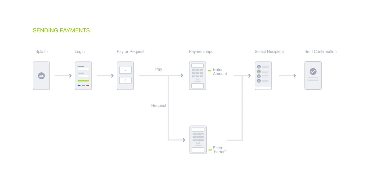
I mapped sending and receiving as two connected flows. Both start with a choice to pay or request, then move through amount, recipient, and confirmation.
Details Worth Noting
Barter is a branch, not a separate app
Requesting adds an Enter "barter" step beside the amount, so trading stays inside the same flow.
One path to confirmation
Paying and requesting converge at recipient selection, which keeps the flow short.
Part 04 · Prototype
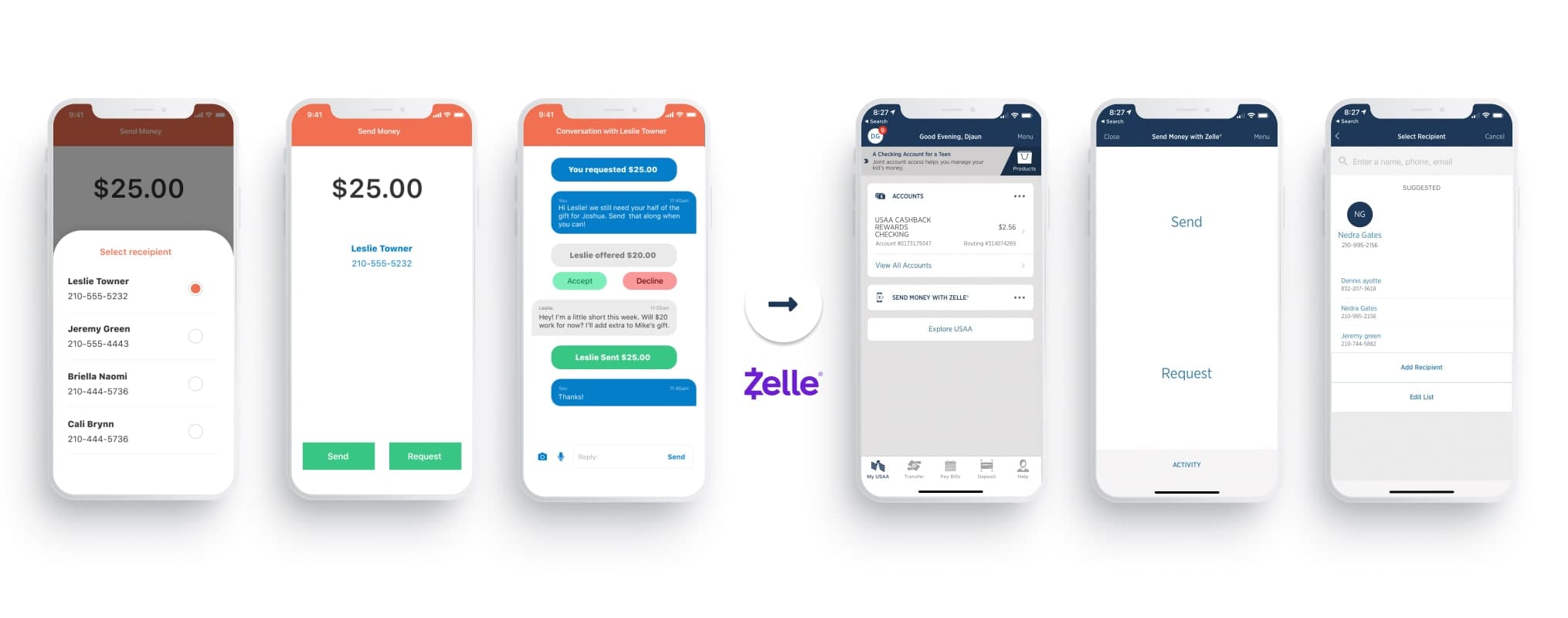
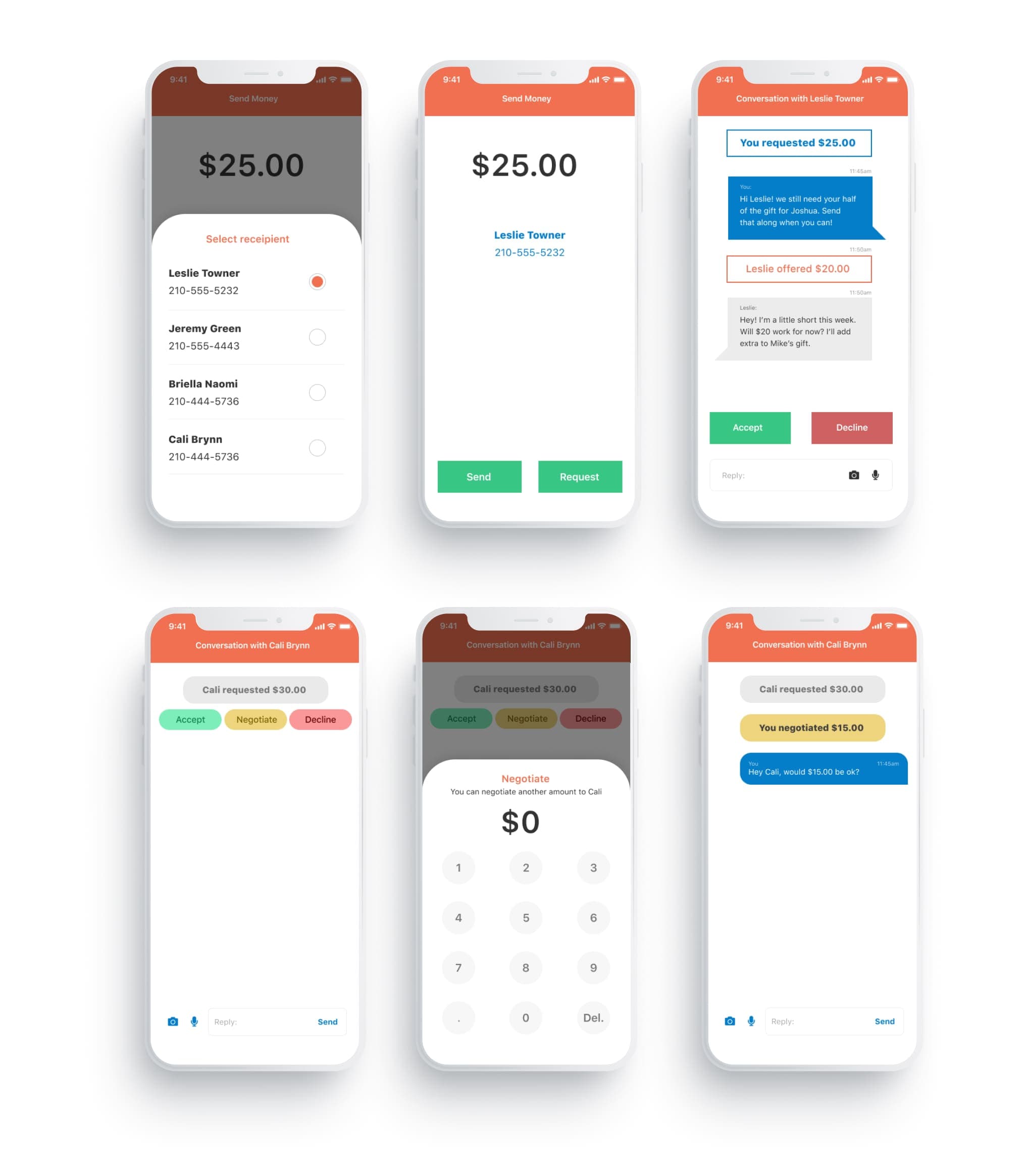
Final screens for testing
The Problem
A request shouldn't end at accept or decline when real conversations include "can I do less this week?"
The Solution
The prototype turns each request into a conversation. Members can accept, decline, or negotiate another amount, and message back and forth in the same thread.
Details Worth Noting
Negotiate is a first class action
It sits between Accept and Decline, and opens a keypad so a counter offer is one step away.
Status reads like a chat
Offers and counter offers appear as messages, such as "You negotiated $15.00," so the history is easy to follow.
Part 05 · Integration
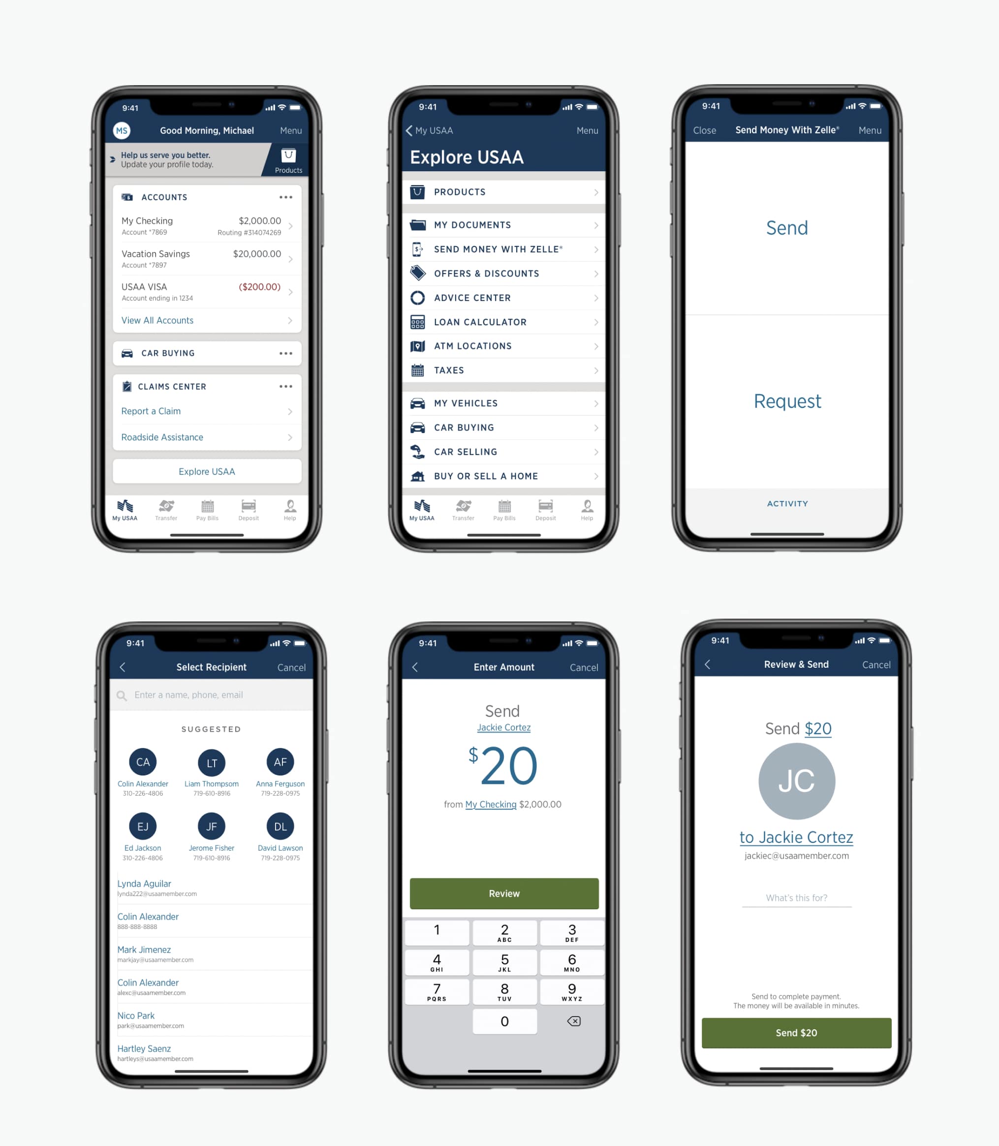
Final screens implemented in the main app
The Problem
The pilot existed to inform the enterprise app, so the learnings had to fit its patterns and its payment rails.
The Solution
We carried the validated parts into the main app's send money experience: a clear send or request choice, suggested recipients, an amount entry screen, and a review step.
Details Worth Noting
Easier to find
Send Money With Zelle appears in the Explore USAA menu and on the My USAA home screen.
Suggested recipients
Frequent contacts appear at the top of Select Recipient, ahead of the full list.
A note on every payment
Review & Send includes a "What's this for?" field, which keeps some of the context behind the money.
Next Case Study